Color Palettes That Instantly Make Your Home Look More Expensive
A beautiful home does not always require expensive furniture, designer accessories, or a massive renovation budget. One of the simplest ways to make an interior look more sophisticated, polished, and luxurious is to choose the right color palette.
Color affects almost everything we experience inside a room. It can make a small space feel larger, create a sense of calm, highlight architectural details, make furniture appear more elegant, and bring visual consistency from one room to another. The right combination of colors can even make affordable furniture and simple decorative pieces look considerably more refined.
The secret is not necessarily choosing bold or fashionable colors. Expensive-looking interiors usually depend on balance, restraint, contrast, layering, and consistency. Neutral colors, warm earthy shades, sophisticated greens, deep blues, creamy whites, muted browns, and carefully selected accent colors can create an elegant atmosphere without requiring a luxury budget.
This guide explores the best color palettes that can make your home look more expensive, explains how to combine colors effectively, and provides practical ideas for living rooms, bedrooms, kitchens, bathrooms, dining areas, hallways, and small spaces.
Why Color Can Make a Home Look More Expensive
Luxury interiors often have one important characteristic: they look intentional.
Every color appears to belong somewhere. Walls, furniture, flooring, curtains, rugs, artwork, lighting, and accessories work together rather than competing for attention.
A poorly coordinated room can contain expensive objects and still look chaotic. Meanwhile, a simple room with inexpensive furniture can look elegant when the colors are carefully selected.
Color contributes to a luxurious appearance in several ways.
1. It Creates Visual Harmony
When colors work together, a room immediately feels more organized. Similar undertones across walls, furniture, fabrics, and accessories help create a cohesive appearance.
2. It Creates Depth
Luxury interiors rarely depend on one flat color. Instead, they use multiple shades of related colors.
For example, a beige room can include:
- Cream walls
- Warm beige furniture
- Tan leather
- Dark brown wood
- Ivory curtains
- Brass accents
The colors are different, but they belong to the same visual family.
3. It Highlights Architectural Features
A sophisticated color scheme can draw attention to moldings, fireplaces, built-in shelves, doors, ceilings, arches, and other architectural details.
4. It Controls Contrast
Contrast can make a room look dramatically more polished. A cream sofa against a warm taupe wall or dark wood against pale walls creates visual definition.
5. It Influences Lighting
Colors interact with natural and artificial light. A warm neutral can feel cozy under warm lamps, while a pale cool shade can feel fresh in daylight.
Understanding this relationship helps prevent colors from looking completely different after sunset.
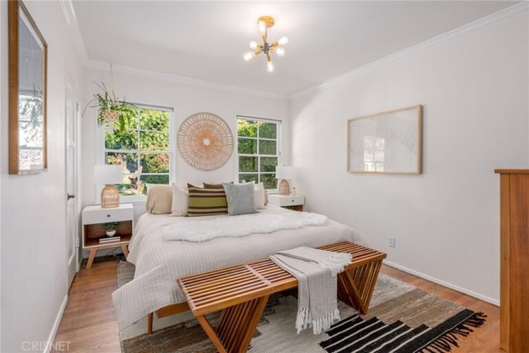
1. Warm White, Beige, and Natural Wood
One of the most timeless luxury-inspired combinations is warm white + beige + natural wood.
This palette feels calm, sophisticated, and expensive without being overly formal.
Instead of using bright white everywhere, choose softer whites with creamy or warm undertones.
Pair them with:
- Sand beige
- Oatmeal
- Taupe
- Light oak
- Walnut
- Tan leather
- Natural linen
This combination works particularly well in living rooms and bedrooms.
How to Use It
Use warm white on the walls, beige for larger upholstered furniture, and natural wood for tables, shelves, or flooring.
Add small amounts of darker brown to create contrast.
For example:
60% warm white
25% beige
10% natural wood
5% dark brown
The result is visually balanced without feeling overly decorated.
Why It Looks Expensive
Natural materials and soft neutral colors have a timeless appearance. They also allow texture to become part of the design.
A linen curtain, wool rug, wooden table, and woven basket can make a neutral room feel rich even when the individual items are relatively affordable.
2. Cream, Taupe, and Chocolate Brown
If you want a warmer and more dramatic neutral palette, consider cream + taupe + chocolate brown.
Cream creates brightness.
Taupe adds sophistication.
Chocolate brown provides depth.
This combination is particularly effective during autumn and winter but can work throughout the year.
Living Room Idea
Imagine a living room with:
- Cream walls
- Taupe sofa
- Chocolate-brown coffee table
- Ivory rug
- Dark brown cushions
- Brass lighting
- Natural wood accessories
The result can feel like a boutique hotel or an upscale private residence.
Avoid Overusing Dark Brown
Chocolate brown is powerful. Too much can make a room feel heavy.
Use it primarily for:
- Furniture
- Decorative frames
- Side tables
- Lighting
- Small accessories
Keep larger surfaces relatively light.
3. Soft Gray, Charcoal, and White
Gray can create an incredibly sophisticated interior when the correct undertones are selected.
A classic combination is:
Soft gray + white + charcoal
Soft gray keeps the room light.
White provides freshness.
Charcoal creates contrast.
This palette works particularly well in modern apartments, contemporary homes, offices, and minimalist interiors.
Creating Luxury With Gray
Avoid using five unrelated gray shades. Instead, choose a controlled range.
For example:
- Warm white walls
- Medium gray sofa
- Charcoal accent chair
- Light gray rug
- Black metal lighting
- White curtains
The limited palette creates a clean appearance.
Add Texture
Gray can sometimes feel cold or flat.
Introduce:
- Wool
- Velvet
- Linen
- Wood
- Stone
- Bouclé
- Matte ceramics
Texture prevents a monochromatic room from looking boring.
4. Greige: The Luxury Neutral
Greige is a combination of gray and beige.
It has become popular because it combines the warmth of beige with the sophisticated character of gray.
Greige works beautifully when you want a neutral interior that feels contemporary without becoming too cold.
Where to Use Greige
Greige can be used on:
- Walls
- Cabinets
- Upholstery
- Curtains
- Rugs
- Bedroom furniture
Pair it with:
- Cream
- Dark wood
- Black
- Brass
- Soft green
Why Greige Looks Sophisticated
Pure beige can sometimes look traditional, while pure gray can feel industrial. Greige sits comfortably between the two.
It is especially useful for open-plan homes where several areas need to share a cohesive color scheme.
5. Sage Green, Cream, and Wood
Green is one of the most effective colors for creating a sophisticated and natural atmosphere.
Sage green is especially versatile.
It is softer than emerald, less intense than forest green, and more interesting than plain beige.
Combine sage green with:
- Cream
- Warm white
- Natural wood
- Tan
- Brass
This creates a relaxed but elegant interior.
Bedroom Application
Consider:
- Sage green walls
- Cream bedding
- Oak nightstands
- Beige curtains
- Brass lamps
- Botanical artwork
The palette feels peaceful and sophisticated.
Kitchen Application
Sage cabinets paired with cream walls and natural wood can create a timeless kitchen.
Use brushed brass or aged brass hardware for additional warmth.
6. Olive Green, Beige, and Brass
For a richer interpretation of green, choose olive.
Olive green has earthy undertones that work beautifully with natural materials.
A sophisticated palette could include:
Olive green + warm beige + walnut + brass
This combination is ideal for:
- Dining rooms
- Studies
- Libraries
- Living rooms
- Bedrooms
Make Olive the Accent
If you’re nervous about painting an entire room olive, introduce it through:
- Curtains
- Cushions
- Accent chairs
- Artwork
- Cabinetry
- Decorative objects
Then keep the surrounding colors neutral.
7. Navy Blue, Cream, and Gold
Navy blue has long been associated with traditional elegance.
When paired with cream and subtle gold or brass, it creates a polished and luxurious appearance.
A Balanced Navy Palette
Use:
- Cream walls
- Navy sofa or accent chair
- Light wood
- Brass lamps
- Cream rug
- Navy cushions
Gold should remain an accent rather than becoming the main feature.
Why This Combination Works
Navy provides depth.
Cream prevents the room from becoming too dark.
Gold introduces warmth and visual sparkle.
Together, they create contrast without excessive color.
8. Deep Blue, Warm White, and Walnut
For a more masculine and sophisticated atmosphere, combine deep blue with warm white and walnut wood.
This palette works particularly well in:
- Home offices
- Libraries
- Dining rooms
- Bedrooms
- Formal living rooms
Walnut adds richness, while deep blue creates drama.
Keep the walls lighter if the room receives limited natural light.
9. Terracotta, Cream, and Natural Wood
Terracotta has become increasingly popular in interiors because of its earthy character.
It brings warmth and personality without feeling overly bright.
Combine terracotta with:
- Cream
- Beige
- Natural wood
- Off-white
- Tan
- Soft brown
This palette works beautifully in Mediterranean, rustic, modern organic, and contemporary interiors.
Small-Dose Terracotta
You don’t necessarily need terracotta walls.
Try:
- Terracotta cushions
- Ceramic vases
- Artwork
- Table lamps
- Rugs
- Decorative bowls
These small accents can transform a neutral room.
10. Rust, Camel, and Ivory
Rust is another rich color that can create an expensive-looking interior.
Combine it with camel and ivory for a warm, sophisticated palette.
For example:
- Ivory walls
- Camel sofa
- Rust cushions
- Dark wood coffee table
- Cream rug
- Bronze lighting
This palette is particularly beautiful in rooms with warm lighting.
11. Black, White, and Warm Wood
Black and white is one of the most recognizable high-contrast palettes.
But black and white alone can sometimes feel harsh.
The solution is to introduce warm wood.
The combination becomes:
Black + warm white + natural wood
This creates a modern but comfortable interior.
Use Black Strategically
Black works well for:
- Window frames
- Lighting
- Coffee tables
- Cabinet hardware
- Picture frames
- Side tables
Avoid making every major object black.
The goal is controlled contrast.
12. Soft Black, Cream, and Brass
If you want a more glamorous appearance, consider soft black with cream and brass.
Instead of extremely bright white, choose ivory or cream.
Then use black for architectural or furniture details.
Add brass through:
- Handles
- Lighting
- Mirrors
- Frames
- Decorative accessories
The combination can look especially elegant in bathrooms and dining rooms.
13. Dusty Blue, Cream, and Light Oak
Dusty blue is a softer alternative to navy.
It works beautifully with:
- Cream
- Ivory
- Light oak
- Beige
- Soft gray
This palette is ideal for bedrooms because it feels calm and understated.
Bedroom Example
Use dusty blue on one wall or in the bedding.
Add:
- Cream duvet
- Oak furniture
- Ivory curtains
- Beige rug
- Soft brass lamps
The room will feel layered without looking busy.
14. Powder Blue, White, and Brass
Powder blue can create an airy and elegant environment.
It is particularly effective in:
- Bathrooms
- Bedrooms
- Small kitchens
- Entryways
Pair it with white walls or cabinetry and small brass details.
The key is to keep the palette soft rather than introducing many bright colors.
15. Burgundy, Cream, and Walnut
For dramatic interiors, burgundy can provide incredible depth.
Burgundy works best when used as an accent.
Pair it with:
- Cream
- Walnut
- Beige
- Brass
- Warm white
Use burgundy for:
- Velvet chairs
- Cushions
- Artwork
- Curtains
- Decorative accessories
A little burgundy can have a strong visual impact.
16. Plum, Taupe, and Cream
Plum can create a sophisticated and slightly dramatic atmosphere.
Because it is a deep color, balance it with lighter neutrals.
A useful combination is:
Plum + taupe + cream + dark wood
This palette works particularly well in formal rooms.
17. Forest Green, Cream, and Dark Wood
Forest green is a powerful color associated with nature and depth.
When combined with cream and dark wood, it can create an elegant library-like atmosphere.
Use forest green on:
- Accent walls
- Built-in cabinets
- Upholstered chairs
- Curtains
Then balance it with cream textiles and dark wood.
18. Emerald Green, Ivory, and Brass
Emerald is brighter and more jewel-like than forest green.
It should be used carefully.
An emerald velvet chair against an ivory wall can become the centerpiece of a room.
Add small brass elements for warmth.
Avoid combining emerald with many other strong colors.
Let it remain the visual star.
19. Beige, Black, and Brass
For a contemporary luxury look, beige + black + brass is extremely effective.
Beige provides softness.
Black creates definition.
Brass provides warmth.
Example
- Beige walls
- Cream sofa
- Black coffee table
- Brass lamp
- Beige rug
- Black picture frames
This is a simple formula that works in many modern homes.
20. Taupe, Black, and Natural Stone
Taupe can also be combined with black and stone materials.
Think:
- Taupe walls
- Black fixtures
- Limestone
- Marble
- Travertine
- Natural wood
This creates a sophisticated organic-modern appearance.
21. Monochromatic Beige
A monochromatic beige interior can look incredibly luxurious when executed correctly.
The key is to use different shades and textures.
For example:
- Cream walls
- Sand-colored sofa
- Beige rug
- Taupe curtains
- Camel chair
- Light brown wood
- Ivory cushions
The colors are similar, but the textures create differentiation.
The Importance of Texture
When color contrast is low, texture becomes more important.
Use:
- Linen
- Wool
- Cotton
- Velvet
- Bouclé
- Leather
- Wood
- Stone
This gives the room visual depth.
22. Monochromatic Gray
A gray-on-gray room can also feel sophisticated.
Combine:
- Pale gray
- Medium gray
- Charcoal
- Soft black
Then add natural wood to prevent the room from feeling too cold.
Metallic accents should be limited and intentional.
23. Cream, Caramel, and Espresso
This palette is perfect for people who love warm interiors.
Cream creates brightness.
Caramel creates warmth.
Espresso creates depth.
Use caramel through:
- Leather furniture
- Cushions
- Rugs
- Curtains
Use espresso for darker furniture and accessories.
24. Sand, Stone, and Warm White
Inspired by natural landscapes, this palette feels calm and expensive.
Use:
- Sand
- Stone gray
- Warm white
- Beige
- Light brown
This works especially well with minimalist and organic interiors.
Add stone, wood, ceramics, and woven materials.
25. Coastal Blue, Sand, and White
A refined coastal palette does not need to rely on bright turquoise or nautical decorations.
Instead, use:
- Soft blue
- Sandy beige
- Warm white
- Natural wood
This creates a subtle coastal atmosphere.
Avoid overusing anchors, stripes, seashells, and other obvious coastal decorations if you want a more sophisticated appearance.
How to Choose the Right Color Palette for Your Home
Choosing a palette begins with understanding the room itself.
Consider the following.
1. Natural Light
Observe the room at different times of day.
A color that looks beautiful in morning sunlight may look completely different under artificial lighting.
North-facing rooms often benefit from warmer colors.
Sunny rooms can accommodate cooler or deeper colors more easily.
2. Flooring
Your floor is one of the largest color surfaces in your home.
If you have warm wooden flooring, warm beige, cream, olive, terracotta, and brown can work beautifully.
If you have cool gray flooring, consider soft gray, blue, white, or neutral shades with compatible undertones.
3. Existing Furniture
Don’t choose wall colors without considering your existing furniture.
Look at:
- Sofa color
- Wood tone
- Curtains
- Rugs
- Cabinetry
- Countertops
- Artwork
Choose colors that connect at least two or three existing elements.
Understanding Undertones
One of the biggest secrets of professional-looking interiors is understanding undertones.
Two colors may both look beige, but one may contain yellow undertones while another contains pink or gray undertones.
If you mix incompatible undertones, the room can look disjointed.
Warm Undertones
Often include:
- Yellow
- Red
- Orange
Cool Undertones
Often include:
- Blue
- Green
- Violet
You do not necessarily need to make every color identical, but the undertones should feel compatible.
The 60-30-10 Color Rule
One of the easiest decorating formulas is the 60-30-10 rule.
60% Main Color
Usually:
- Walls
- Large rugs
- Major furniture
30% Secondary Color
Usually:
- Curtains
- Accent furniture
- Bedding
- Cabinets
10% Accent Color
Usually:
- Cushions
- Artwork
- Lamps
- Decorative objects
For example:
60% cream
30% sage green
10% brass and dark brown
This creates a balanced visual hierarchy.
How to Use Expensive-Looking Colors in the Living Room
The living room is usually the most visible space in a home.
A sophisticated palette can dramatically improve its appearance.
Option 1: Cream + Beige + Walnut
Ideal for a warm, timeless appearance.
Option 2: Greige + Black + Brass
Ideal for contemporary homes.
Option 3: Sage + Cream + Wood
Ideal for organic interiors.
Option 4: Navy + Ivory + Walnut
Ideal for classic interiors.
Option 5: Taupe + Chocolate + Cream
Ideal for cozy luxury.
How to Use Color in the Bedroom
Bedrooms benefit from relaxing colors.
Excellent options include:
- Sage
- Dusty blue
- Cream
- Taupe
- Warm beige
- Soft gray
- Olive
- Muted brown
Avoid overly intense colors if your primary goal is relaxation.
Layer the Bedding
Instead of matching every piece exactly, use related shades.
For example:
- Cream sheets
- Beige duvet
- Taupe blanket
- Sage cushions
- Natural wood furniture
This looks more sophisticated than buying a perfectly matching bedding set.
Luxury Kitchen Color Palettes
Kitchens often look expensive when their color scheme is restrained.
Consider:
Cream + Walnut + Brass
Warm and timeless.
White + Black + Wood
Modern and architectural.
Sage + Cream + Brass
Soft and natural.
Taupe + Stone + Dark Wood
Sophisticated and contemporary.
Navy + White + Brass
Classic and elegant.
Bathroom Color Palettes
Bathrooms can benefit from spa-inspired colors.
Try:
- Warm white
- Beige
- Taupe
- Stone
- Sage
- Soft gray
Natural stone and brass details can add sophistication.
A small bathroom can look especially elegant when you use one consistent palette throughout the room.
Dining Room Color Ideas
Dining rooms can handle deeper colors.
Consider:
- Forest green + cream
- Navy + ivory
- Burgundy + beige
- Olive + taupe
- Charcoal + warm white
Dark colors can create intimacy and make evening lighting feel more dramatic.
Hallway and Entryway Colors
Entryways create the first impression of a home.
Consider:
- Warm white
- Greige
- Taupe
- Soft olive
- Deep navy
- Beige
A dark console table against a light wall can create instant contrast.
Add a mirror and warm lighting for a polished effect.
The Role of Metallic Colors
Metallic finishes should usually be treated as accents.
Common choices include:
- Brass
- Bronze
- Copper
- Chrome
- Nickel
- Blackened metal
The most important rule is consistency.
You do not need every metal to match perfectly, but avoid introducing too many unrelated finishes.
Brass
Works beautifully with:
- Cream
- Navy
- Green
- Beige
- Brown
Black Metal
Works well with:
- White
- Beige
- Gray
- Wood
- Green
Why Too Many Colors Can Make a Home Look Cheaper
One common decorating mistake is trying to introduce too many colors.
Imagine a room containing:
- Bright red
- Turquoise
- Yellow
- Purple
- Orange
- Green
- Blue
Even if each item is attractive individually, the room may lack visual direction.
Luxury interiors often use fewer colors but more variation in:
- Texture
- Shape
- Material
- Scale
- Pattern
This creates sophistication without visual chaos.
Use One Strong Accent Color
If you love bright colors, you don’t have to avoid them.
Instead, choose one.
For example:
Cream + beige + emerald
or
White + gray + cobalt blue
or
Taupe + brown + rust
The accent color becomes intentional rather than overwhelming.
Color and Lighting
Lighting can completely change how a color appears.
Warm bulbs tend to make warm colors appear richer.
Cool lighting can make some colors appear sharper or more blue.
Therefore, always test paint samples in both daylight and evening lighting.
Place samples directly on the wall and observe them for at least a full day.
Paint Finish Matters Too
The same color can appear different depending on its finish.
Matte
Soft and sophisticated.
Eggshell
Practical and subtly reflective.
Satin
More durable and slightly reflective.
Gloss
Dramatic and highly reflective.
For walls, matte or low-sheen finishes often create a refined appearance.
Gloss can be effective for selected architectural details.
Ceiling Colors
White ceilings are classic, but they aren’t the only option.
A slightly lighter version of the wall color can create a sophisticated monochromatic effect.
For example:
- Beige walls
- Light cream ceiling
or:
- Sage walls
- Very pale green ceiling
This can create a more integrated appearance.
Doors and Trim
Don’t underestimate doors and trim.
A room can look dramatically different when trim is thoughtfully coordinated.
Options include:
- Same color as walls
- Slightly lighter shade
- Crisp warm white
- Deep contrasting color
- Dark wood
Black or dark doors can create architectural drama in otherwise neutral interiors.
How to Make Affordable Furniture Look Expensive With Color
You do not need designer furniture.
Instead, create a sophisticated background.
For example, an inexpensive beige sofa can look much more polished when paired with:
- Quality-looking neutral cushions
- A textured rug
- Dark wood coffee table
- Coordinated curtains
- Warm lighting
- Simple artwork
Color creates the framework within which furniture is perceived.
Affordable Ways to Change Your Home’s Color Palette
You don’t need to repaint your entire home.
Start with inexpensive changes.
Change Cushion Covers
Cushions are one of the easiest ways to introduce a new color.
Replace Curtains
Curtains cover a large visual area and can significantly change the atmosphere.
Add a Rug
A large rug can connect furniture and colors.
Change Artwork
Artwork introduces color without permanent changes.
Add Throws
Throws are inexpensive and easy to replace seasonally.
Introduce Plants
Greenery works with almost every neutral palette.
Change Hardware
Cabinet handles and drawer pulls can introduce brass, black, or bronze accents.
Seasonal Color Palettes
Your primary home palette can remain consistent while accent colors change throughout the year.
Spring
- Soft green
- Cream
- Pale blue
- Light beige
Summer
- White
- Sand
- Soft blue
- Natural wood
Autumn
- Rust
- Olive
- Camel
- Brown
Winter
- Cream
- Chocolate
- Burgundy
- Forest green
This approach keeps your home fresh without requiring major renovations.
Common Color Mistakes to Avoid
Mistake 1: Choosing Paint From a Tiny Sample
A small paint chip can look completely different across a large wall.
Always test a larger sample.
Mistake 2: Ignoring Undertones
A beige with pink undertones may clash with a yellow-based cream.
Mistake 3: Using Too Much Accent Color
Accent colors should remain accents.
Mistake 4: Matching Everything Exactly
Perfectly matching furniture, curtains, cushions, and rugs can make a room look like a showroom.
Use related shades instead.
Mistake 5: Ignoring Lighting
Always evaluate colors under your actual lighting conditions.
Mistake 6: Forgetting Texture
A neutral room needs texture to prevent it from feeling flat.
Mistake 7: Using Too Many Metals
Choose one dominant metallic finish and perhaps one supporting finish.
How to Create a Luxury Color Palette on a Small Budget
A luxury appearance is more about coordination than cost.
Start with three colors.
For example:
Warm white + beige + dark brown
Then add:
- One wood tone
- One metal finish
- One accent color
Keep the large surfaces neutral.
Spend your money selectively on items that are highly visible.
You can create an impressive room with affordable furniture if the palette is coherent.
Color Palettes for Small Rooms
Small rooms do not automatically need to be pure white.
Try:
- Warm white + beige
- Pale greige + cream
- Soft sage + ivory
- Dusty blue + white
- Light taupe + cream
Keep the ceiling lighter to create a sense of openness.
Using similar colors throughout the room can also reduce visual fragmentation.
Color Palettes for Large Rooms
Large rooms can handle deeper colors.
Consider:
- Forest green
- Navy
- Charcoal
- Olive
- Chocolate
- Burgundy
You can use darker walls while maintaining balance through lighter furniture and textiles.
Creating Flow Between Rooms
An expensive-looking home usually feels connected from one room to another.
You don’t need to use exactly the same color everywhere.
Instead, repeat colors.
For example:
Living Room
Cream + beige + olive
Kitchen
Cream + walnut + olive
Bedroom
Cream + taupe + olive
The repeated olive accent creates continuity.
Color and Natural Materials
Natural materials often make colors feel richer.
Combine your chosen palette with:
- Wood
- Stone
- Linen
- Cotton
- Wool
- Rattan
- Ceramic
- Leather
A simple beige room can become much more sophisticated when natural textures are layered throughout.
The Power of Dark Accents
Even very light interiors need some visual weight.
Introduce dark accents through:
- Black frames
- Dark wood
- Charcoal cushions
- Bronze lamps
- Dark furniture
These accents anchor the space.
Without them, a neutral room can sometimes feel washed out.
The Power of Warm Neutrals
Warm neutrals have become especially popular because they create comfort while remaining sophisticated.
Useful shades include:
- Cream
- Ivory
- Sand
- Beige
- Taupe
- Camel
- Mushroom
- Warm gray
These colors can serve as the foundation of almost any elegant interior.
The Power of Earth Tones
Earth tones create a natural, grounded feeling.
Popular options include:
- Terracotta
- Olive
- Rust
- Clay
- Sand
- Brown
- Moss
- Warm beige
These colors work particularly well with wood and natural stone.
The Power of Jewel Tones
Jewel tones can add drama.
Examples include:
- Emerald
- Sapphire
- Ruby
- Amethyst
- Deep teal
Use them selectively.
A jewel-toned accent chair or cushion can be enough to transform a neutral room.
Color Palette Ideas at a Glance
Here are several combinations you can use as inspiration:
Palette 1: Timeless Luxury
Warm white + beige + walnut + brass
Palette 2: Organic Elegance
Cream + sage + oak + tan
Palette 3: Modern Luxury
Greige + black + brass + cream
Palette 4: Classic Sophistication
Navy + ivory + walnut + brass
Palette 5: Earthy Luxury
Terracotta + cream + brown + wood
Palette 6: Dramatic Interior
Forest green + cream + dark wood
Palette 7: Soft Bedroom
Dusty blue + ivory + light oak
Palette 8: Cozy Luxury
Camel + cream + chocolate + bronze
Palette 9: Contemporary Neutral
Taupe + warm white + black + stone
Palette 10: Rich Accent
Cream + beige + burgundy + walnut
How to Build Your Own Expensive-Looking Palette
If none of the combinations above feels perfect, create your own using a simple process.
Step 1: Choose Your Base
Start with:
- Cream
- White
- Beige
- Greige
- Taupe
- Soft gray
Step 2: Select a Secondary Color
Choose:
- Green
- Blue
- Brown
- Terracotta
- Charcoal
Step 3: Add a Dark Anchor
Consider:
- Black
- Walnut
- Espresso
- Dark bronze
Step 4: Select a Metal
Choose:
- Brass
- Bronze
- Chrome
- Nickel
- Black metal
Step 5: Introduce Texture
Use:
- Linen
- Wool
- Wood
- Stone
- Leather
- Ceramic
This formula can produce a cohesive palette without requiring professional interior design services.
Final Thoughts
Making a home look expensive is not simply about buying expensive things. It is about creating an environment where every element feels intentional.
Color is one of the most powerful tools available because it influences the entire room at once.
Warm whites, beige, taupe, greige, sage, olive, navy, forest green, terracotta, chocolate brown, dusty blue, cream, and carefully selected dark accents can all create sophisticated interiors when used thoughtfully.
The most successful palettes usually have three important qualities: balance, consistency, and restraint.
Start with a neutral foundation. Add one secondary color. Introduce a darker anchor for contrast. Then bring in natural materials and a small amount of metal or accent color.
Most importantly, don’t feel pressured to follow every interior design trend. A genuinely expensive-looking home should feel comfortable, personal, and timeless.
Whether you are decorating a small apartment, renovating a family home, refreshing a bedroom, or simply looking for inexpensive ways to improve your living space, the right color palette can make an enormous difference.
You don’t need a huge budget to create a beautiful home.
Sometimes, all you need is the right combination of colors.
Frequently Asked Questions
What colors make a home look expensive?
Warm white, cream, beige, taupe, greige, deep green, navy, chocolate brown, and muted earth tones can create a sophisticated appearance when coordinated properly.
Is beige still good for luxury interiors?
Yes. Beige can look extremely elegant when layered with different textures and shades. Combining beige with wood, cream, black, brass, or darker brown can create depth.
What is the best neutral color for an expensive-looking home?
There is no single best neutral for every home. Warm white, greige, taupe, cream, and beige are versatile options, but the right choice depends on lighting, flooring, furniture, and undertones.
Can dark colors make a room look expensive?
Yes. Deep navy, forest green, charcoal, olive, and chocolate brown can create depth and drama when balanced with lighter colors and sufficient lighting.
What color combinations look luxurious?
Some popular combinations include cream and walnut, beige and brass, sage and natural wood, navy and ivory, greige and black, and forest green with cream.
How many colors should a room have?
A useful starting point is three main colors: a dominant color, a secondary color, and an accent color. You can then introduce variations through textures and materials.
Does white make a home look expensive?
White can create a clean and elegant appearance, but warm whites and creamy whites often feel softer and more layered than stark white.
What colors make small rooms look bigger?
Light neutrals such as warm white, cream, pale beige, light greige, and soft blue can help small rooms feel more open. Keeping colors visually consistent can also reduce fragmentation.
How can I make my home look expensive without spending much money?
Focus on color coordination, decluttering, lighting, textiles, artwork, hardware, and natural textures. Changing cushion covers, curtains, rugs, or paint can have a significant visual impact without requiring a full renovation.
Should every room use the same colors?
Not necessarily. Instead, repeat one or two colors throughout the home. This creates continuity while allowing each room to have its own personality.
What color goes best with natural wood?
Cream, beige, sage green, olive, navy, warm white, terracotta, and soft gray can all work beautifully with natural wood. The best choice depends on whether the wood has warm or cool undertones.
Is black good for luxury interiors?
Black can be an excellent accent color. Black frames, lighting, furniture, hardware, and doors can create contrast and make lighter colors appear more refined.
What is the 60-30-10 color rule?
The 60-30-10 rule suggests using approximately 60% of a dominant color, 30% of a secondary color, and 10% of an accent color. It is a useful starting point for creating visual balance.
Can colorful homes still look expensive?
Absolutely. The key is controlled color use. A strong color such as emerald, burgundy, rust, or cobalt can look sophisticated when surrounded by restrained neutrals.
What is the most important rule when choosing interior colors?
Choose colors that work with your home’s natural light, flooring, furniture, and existing materials. A beautiful color in one room may look completely different in another environment.
Conclusion
A sophisticated home begins with thoughtful choices rather than expensive purchases. The right color palette can unify furniture, architecture, lighting, textiles, and accessories while creating a polished atmosphere.
Start with a strong neutral foundation, add one or two supporting colors, introduce contrast carefully, and use texture to create depth. Whether your style is modern, classic, minimalist, organic, traditional, or contemporary, there is a sophisticated color palette that can work for your space.
The goal is not to make your home look expensive simply for the sake of appearance. The goal is to create a home that feels intentional, harmonious, comfortable, and timeless.
With the right colors, even a modest home can have the visual sophistication of a professionally designed interior.